Good webinar slides do a specific job at a specific live moment. They make the speaker's point easier to follow inside the actual viewing frame, cue participation and next steps, and remain useful when someone watches the replay later.
That makes webinar slide design an operating task as much as a visual one. Start with the promise that brought people to the session, give every slide a job, separate attendee content from presenter and producer instructions, and review the finished deck in the environment where it will be delivered.
This guide gives B2B marketing teams a practical framework for doing that, including a slide-job map, a worked product-marketing example, and a five-gate review checklist.
What makes webinar slides different from ordinary presentation slides
A webinar deck is the attendee-facing visual layer of a live session. It should clarify the speaker's message without becoming a transcript of the talk.
The viewing conditions matter. A slide that looks spacious on a designer's full-screen monitor may become cramped once it sits beside presenter video, chat, Q&A, captions, browser controls, or branded player elements. Screen sharing can also introduce compression, and a useful live prompt can become confusing when someone sees it later on replay.
The peer-reviewed guide Twelve tips to present an effective webinar notes that slides may be the attendee's main visual context and that some people may watch on limited screen space. Its authors recommend clear slides, simple and consistent design, essential rather than script-length text, thoughtful images, platform familiarity, interaction planning, and practice.
A useful diagnostic is to imagine the speaker disappearing for ten seconds. The current slide should still tell the attendee where they are and what the point is. It should not contain everything the speaker planned to say.
That distinction separates four documents that teams often blur together:
- Attendee slides orient and explain.
- Speaker notes hold phrasing, examples, evidence, and transition prompts.
- Moderator cues coordinate introductions, questions, handoffs, and issue response.
- The run of show assigns owners, timings, technical actions, and fallback paths.
Keeping those jobs separate makes the deck easier to read and the live session easier to operate.
Start with the registration promise and one useful outcome
Before choosing a template, copy the promise from the registration page into the working brief. Then finish this sentence:
By the end of this webinar, the attendee should understand, decide, or be able to do ______.
That outcome becomes the filter for every section and slide. If a section does not help deliver the promise, it belongs in a follow-up resource, a different session, or nowhere at all.
Turn the outcome into a small number of meaningful sections. Each section should answer a question the attendee needs resolved in order to reach the promised result. The detailed timing and session-flow work belongs in a webinar agenda template; the deck should express that structure visually without duplicating the full agenda.
For example, a product-marketing webinar promising to help teams decide whether a new workflow fits their launch might use four sections:
- The problem the workflow solves.
- The decision criteria teams should use.
- A worked example and product demonstration.
- The next step for teams that want to test it.
This structure is more useful than starting with a target slide count. It gives the deck a clear narrative and prevents the template from dictating the content.
Build the deck from slide jobs, not page count
The right number of slides follows the number of useful visual changes. Use a new slide when the audience needs a new visual job, then validate the sequence through rehearsal. A universal slides-per-minute formula cannot account for a diagram that needs explanation, a ten-second section marker, a live demo, or a discussion prompt.
Use this slide-job map to build the first pass:
| Slide job | Question it answers | What appears on screen | What belongs in speaker notes | Optional live cue | Replay check |
|---|---|---|---|---|---|
| Promise and title | Why should I stay? | Session promise, title, speaker identity | Opening language and housekeeping | Welcome prompt | Does the promise still make sense on demand? |
| Outcome and agenda | Where are we going? | Outcome and short section map | Timing and transition detail | Opening question | Can a replay viewer follow the route? |
| Context or problem | What needs to change? | One clear problem, example, or visual | Supporting nuance and caveats | Chat prompt | Is the context understandable without live chat? |
| Model or teaching point | How should I think about this? | A named framework or focused diagram | Explanation and edge cases | Poll or reflection | Is the model readable at player size? |
| Evidence or worked example | What does this look like? | Simplified evidence, annotated example, or result | Source detail and methodology | Question cue | Are sources and labels still inspectable? |
| Section transition | What comes next? | New section and its purpose | Handoff wording | Presenter change | Does the replay transition feel intentional? |
| Participation cue | What should I respond to? | One question and clear response method | How the host will use responses | Poll, chat, or Q&A | Is the prompt removed or explained on replay? |
| Demo handoff | What will I see now? | Demo objective and fallback visual | Setup steps and contingency | Screen-share cue | Can the replay survive an edited or failed demo? |
| Next-step CTA | What can I do next? | Relevant action and plain-language value | Offer detail and transition | Live or replay CTA | Is the action still available later? |
| Recap, Q&A, and close | What matters now? | Key takeaways and close | Q&A routing and final wording | Question prompt | Does the ending work without a live room? |
Some slides can combine related jobs. A recap can also introduce the next step, for example. Split a slide when the jobs compete for attention or require different live actions.
Templates are useful for visual consistency, shared spacing, and faster production. They cannot decide the message, the evidence, the interaction, or the next useful step. Make those editorial decisions first, then use the template to express them clearly.
Design for the live viewing frame
Approve each important slide at approximately the size attendees will see, not only in full-screen presentation mode. Shrink the deck, add the space that presenter video, controls, captions, or chat may occupy, and check whether the main point is still obvious.
Use a clear hierarchy:
- Give the slide one dominant visual job.
- Keep essential text short enough to read without competing with the speaker.
- Use deliberate whitespace to separate ideas.
- Make charts and screenshots legible without an apology.
- Keep layouts consistent so the attendee can spend less effort decoding them.
- Use high-resolution visuals that survive screen sharing and recording.
A 16:9 canvas is a common starting point for current webinar delivery, but it is not a guarantee. Test the actual platform, player, recording, and likely device sizes.
Progressive disclosure can help when several related points need to appear in sequence, but every animation adds operational risk. If the sequence depends on perfect timing or does not survive recording well, use separate slides instead.
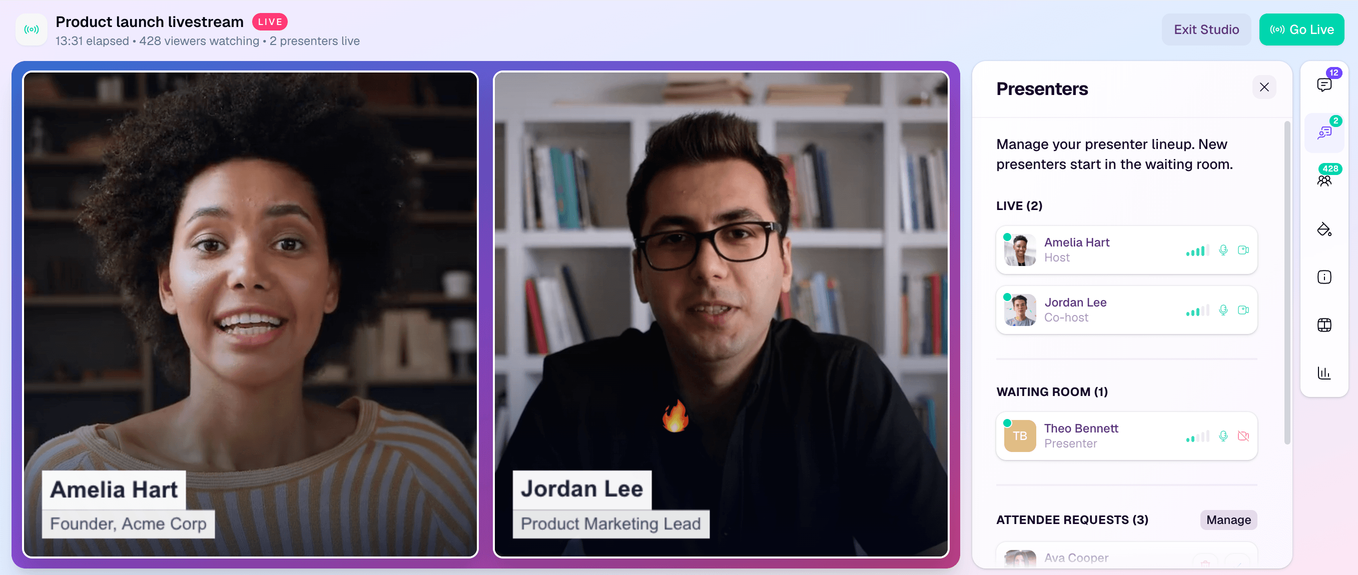
The live environment should influence the deck before the final rehearsal. A browser-based webinar studio such as HeyStream can bring slides and screen demos, presenters, layouts, polls, Q&A, uploaded media, recording, and replay into one production flow. The platform does not design the deck for you, so the team still needs to test how its content appears inside that flow.
Put examples, evidence, and sources on slides responsibly
Examples are usually more useful than abstract claims, but they need editing. A live slide should show the part of an example that matters now, while the speaker notes hold supporting detail.
For charts and data:
- Preserve the original meaning and scale.
- Remove decorative elements that make the data harder to inspect.
- Label the takeaway rather than asking attendees to hunt for it.
- Include a readable source name and reference.
- Move methodology detail to notes or a follow-up resource when it would make the live slide unreadable.
Do not use a screenshot of a dense spreadsheet as a chart. Rebuild the small part the audience needs, and provide the complete source separately if inspection matters.
Plan for replay at the same time. A live phrase such as "answer the poll on your right" may be meaningless later. A replay-safe slide can state the underlying question and explain how viewers should use it even when the poll itself is gone.
If you share the finished deck as a PDF, review the exported file instead of assuming the presentation's structure survived. Check titles, reading order, links, alternative text, and tags in the format people will actually receive.
Plan interaction and the next step inside the deck
Polls, questions, chat prompts, and CTAs should be part of the deck sequence, not last-minute interruptions.
For every interactive moment, define:
- The question the audience sees.
- How attendees should respond.
- Who launches and closes the interaction.
- What the presenter will do with the response.
- What can and cannot be inferred from it.
- What a replay viewer should see instead.
A poll response can support the live conversation. It does not, on its own, prove buyer intent, lead quality, or future behaviour. The interactive webinar playbook covers the wider facilitation job; the deck's role is to make the prompt, pause, and transition visible.
Treat the CTA the same way. It should be the next useful step connected to the session promise, not a surprise sales slide. State the action, explain why it is relevant, and give people enough time to decide. If the platform supports webinar CTAs during live and replay, align the on-screen slide with the action available in the viewing experience.
The slide and CTA should still make sense if the viewer takes no action. Avoid inflated urgency, vague buttons, and claims that clicking will produce a result the offer cannot guarantee.
Separate attendee slides from the operating layers
Trying to put every instruction into the visible deck creates clutter and weakens ownership. Assign each piece of information to its proper layer.
| Layer | Audience | What it owns | Example |
|---|---|---|---|
| Attendee slide | Viewers | Orientation, explanation, examples, prompts, next steps | "Choose the workflow that matches your launch risk" |
| Speaker notes | Presenter | Language, evidence detail, transitions, optional examples | "Contrast the manual and automated paths, then pause" |
| Moderator cue | Moderator | Introductions, Q&A triage, handoffs, issue response | "Open Q&A, group duplicate questions, cue next speaker" |
| Run of show | Producer and team | Exact timing, owner, technical action, fallback | "24:00 launch poll; producer owns; use chat prompt if poll fails" |
This separation is especially valuable during presenter changes, demos, Q&A, and technical issues. A webinar moderator script can handle detailed handoffs and issue cues without asking attendees to read backstage instructions.
Rehearse in the real delivery environment
A deck rehearsal is not complete when the presenter has read the slides aloud. Practice the operating moments:
- Bring each presenter in and out.
- Share the deck and switch to a live demo.
- Launch and close each poll.
- Move from audience questions back to the prepared sequence.
- Display the next-step CTA.
- Play any uploaded media.
- Test captions and the expected player layout.
- Confirm recording and replay behaviour.
Time the talk as a whole rather than assigning the same duration to every slide. Mark content that can be cut without breaking the promise if a discussion or demo runs long.
Create a fallback for the moments most likely to fail. If screen sharing stops, can the producer show a static image? If an embedded video will not play, can the presenter explain the point without it? If a speaker drops out, who owns the next section? If the CTA cannot be displayed, is there a clear spoken and on-screen alternative?
Rehearsal should make the deck simpler. If a transition repeatedly causes confusion, fix the slide job, cue, or ownership instead of relying on the team to remember a workaround.
Run an accessibility and replay QA pass
Accessibility is broader than contrast. Microsoft's PowerPoint accessibility guidance recommends checking reading order, unique slide titles, sufficient contrast, alternative text, meaningful link text, and simple table structures. It also recommends using the Accessibility Checker and testing the finished deck with a screen reader.
Use that as a practical review sequence:
- Give every slide a unique, descriptive title, including slides whose visual design hides the title.
- Check that objects are read in a logical order.
- Add concise alternative text that explains the purpose of meaningful visuals.
- Confirm that colour is not the only way information is communicated.
- Use sufficient contrast and readable text, then test at the final player size.
- Replace vague links such as "click here" with destination-aware text.
- Keep tables simple, with clear headers, or present the information another way.
- Caption embedded video and check any exported handout separately.
- Run the authoring tool's accessibility checker.
- Manually inspect the deck and, where practical, navigate it with a screen reader.
An automated checker is a useful pass, not proof that the deck is accessible in every context.
Then watch a rehearsal capture or recording at normal player size. Confirm that prompts, references, transitions, links, and CTAs still make sense after the live moment. If the recording will feed a wider webinar content repurposing workflow, make sure the deck provides clean section boundaries and visuals that can be understood outside the original session.
The five-gate webinar slide review
Use this checklist before the deck is approved.
1. Promise
- Does every section support the advertised outcome?
- Does the opening tell attendees what they will understand, decide, or do?
- Has unrelated detail moved to notes or a follow-up resource?
2. Live view
- Is essential content readable at the expected player size?
- Do presenter video, captions, chat, controls, or branding cover anything important?
- Will screenshots, charts, and tables survive screen sharing and recording?
3. Delivery
- Do presenters, moderators, and producers know who owns each cue?
- Are polls, questions, demos, media, and handoffs rehearsed?
- Is there a fallback for each important technical transition?
4. Action
- Is the next step relevant to the webinar promise?
- Does the CTA explain what happens next without overpromising?
- Will the action remain available and understandable on replay where intended?
5. Access and reuse
- Have titles, reading order, contrast, alt text, links, sources, captions, and export been checked?
- Does the recording make sense without the live chat or spoken housekeeping?
- Can future editors identify clean sections, examples, and transitions?
Use a firm stop rule: if a slide cannot perform its job in the live frame, simplify it, split it, move detail to notes, or remove it.
Worked example: turn one dense slide into a live sequence
Imagine a product-marketing team preparing a webinar called "How to reduce launch risk across sales, product, and marketing." One draft slide contains a paragraph describing four risks, a six-step process, a customer quote, and a screenshot of the product.
It is complete as a document and weak as a live visual. Split it into four jobs:
Slide 1: section signpost
On screen: "Four places launch handoffs break."
Speaker note: Connect the section to the promised outcome and explain that the next few minutes will help attendees diagnose their current process.
Moderator cue: Watch for questions about ownership and save implementation-specific questions for the demo.
Replay note: The title gives the section a clean chapter boundary.
Slide 2: focused model
On screen: A simple four-part loop showing brief, build, enable, and learn.
Speaker note: Define each handoff and name one observable failure mode.
Interaction cue: Ask attendees which handoff creates the most rework in their team.
Replay note: Keep the question visible as a reflection prompt even if the live poll is removed.
Slide 3: worked example
On screen: One anonymised launch moving through the four handoffs, with the failed and improved paths highlighted.
Speaker note: Explain the decision made at each step and identify what evidence changed the route.
Producer cue: Prepare the product demo while the presenter explains the final step.
Replay note: Add labels so the example remains understandable without the spoken transition.
Slide 4: audience prompt and demo handoff
On screen: "Which decision would remove the most uncertainty from your next launch?"
Speaker note: Summarise the model, acknowledge common answers, and explain what the demo will show.
Moderator cue: Pull one useful audience response into the transition.
Fallback: If screen sharing fails, show a static annotated image of the product workflow.
The rewritten sequence contains less text but more operational detail. Attendees see only what helps them follow the moment, while the team still has the information needed to deliver it reliably.
Build the deck as part of the webinar system
A webinar deck is not a decorative file added after the session has been planned. It connects the registration promise to the live explanation, the audience moments that need a response, the next useful action, and the replay people may watch later.
Build from slide jobs, test inside the real viewing frame, keep backstage instructions in their proper layers, and rehearse every transition that matters. If your next step is session structure, start with the B2B webinar agenda worksheet. If your next step is live delivery, review how a browser-based webinar studio supports presenters, shared content, audience interaction, and replay.