A webinar registration page is often treated like a small admin step: add the title, drop in a form, paste the speaker bio, and move on.
That undersells the page.
For a B2B webinar, the registration page is the first moment someone decides whether the session is worth their time. It also creates the first audience signal your team can use later: what topic pulled someone in, what source they came from, what they told you about themselves, and whether they eventually showed up live or watched the replay.
The strongest webinar registration pages do both jobs. They make registration easy, and they set up a better live session, replay, and follow-up workflow. That makes registration the first step in a broader webinar funnel framework.
Start With the Decision the Page Needs to Create
Before choosing a layout or writing form fields, define the decision your page needs to help someone make.
The decision is not simply "Should I register?"
It is closer to:
- Is this topic relevant enough to give my time to?
- Will the session answer a problem I actually have?
- Do I trust the speaker or company to make the session useful?
- Is the timing clear enough that I can commit?
- Is the signup process worth the effort?
That decision lens keeps the page focused. A webinar registration page does not need to explain every detail of your product, your company, or your broader event program. It needs to make the value of this session obvious and make the next step easy.
If you are running a recurring program, this becomes even more important. The page should support the wider webinar program, but it still needs to give each individual session a clear reason to exist.
Make the Promise Specific Enough to Earn Registration
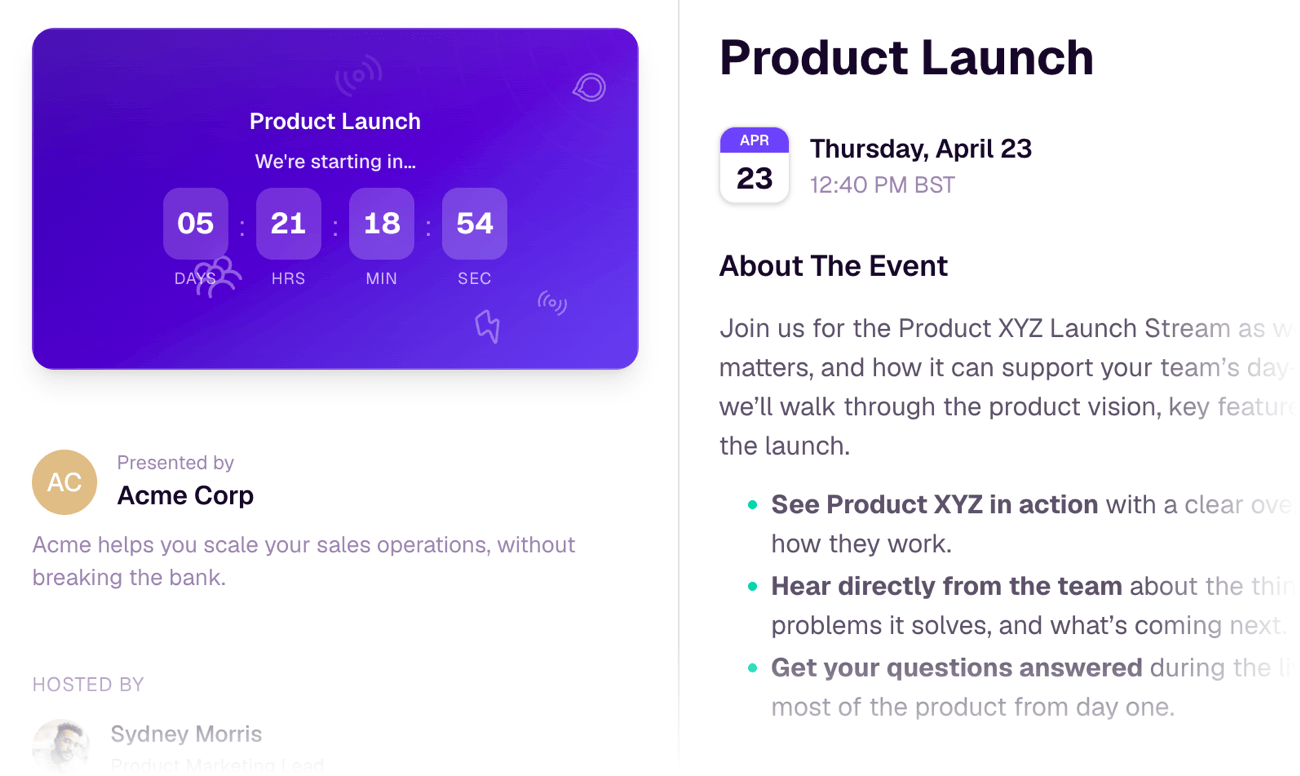
The headline is usually the most important copy on the page.
A weak headline describes the format. A stronger headline names the useful outcome.
For example, "Join Our May Webinar" gives the reader almost nothing to evaluate. "How to Turn Webinar Questions Into Better Follow-Up" gives them a clearer reason to care.
The page should quickly answer:
- who the session is for
- what problem it helps with
- what the attendee will understand or be able to do afterward
- why attending live is useful
That last point matters. If the page does not explain why the live session is worth attending, many people will assume they can wait for the replay. That is not always bad, but it should be intentional. If live Q&A, teardown, discussion, or timely context is part of the value, say so plainly.
Good registration-page copy is specific without overpromising. Avoid unsupported claims about guaranteed pipeline, attendance, or conversion. The page should make a credible promise the session can actually keep.
Make the Essentials Easy to Scan
Most people scan a webinar registration page before they read it carefully.
That means the essentials should be visible without work:
- title
- date
- time and timezone
- session length
- speaker names and roles
- who should attend
- what the attendee will learn
- primary registration action
This is not just a design preference. Clarity reduces hesitation. If someone has to hunt for the time, wonder whether the session is live or on-demand, or guess whether the topic fits their role, the page is creating avoidable friction.
For product-led or education-led webinars, speaker credibility also matters. A short speaker section should explain why the person is worth listening to, not just where they work. A job title can help, but the stronger signal is relevance: what perspective, experience, or practical knowledge will they bring to the session?
Keep the Form Short, but Useful
The registration form is where teams often create the most friction.
The default should be simple: collect what you need to deliver the session and follow up well. For many webinars, that means name and email. For B2B sessions, company, role, or one qualifying question may be useful if the team will actually use that information.
The important rule is practical: do not ask for data you will ignore.
Every extra field should have a job. If company name helps segment follow-up, it may earn its place. If role helps tailor sales handoff or content recommendations, it may be worth asking. If phone number only exists because an old form template included it, remove it.
The better question is not "How many fields can we get away with?" It is "Which information will change what we do next?"
That framing keeps the form aligned with the audience experience and the team's follow-up workflow.
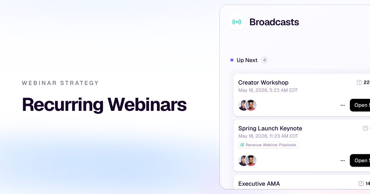
Treat Registration as the First Audience Signal
Registration is not the end of the pre-event funnel. It is the start of the audience record.
Once someone registers, you can begin to understand:
- which source or campaign brought them in
- which topic or promise attracted them
- which role, company, or segment they belong to
- whether they attend live
- whether they watch the replay
- whether they click a CTA or take a follow-up action
Those signals become more useful when they are connected. A registrant from a partner campaign who attends live and clicks a product CTA should not be treated the same as someone who registers from a newsletter and never watches. Both may matter, but they need different follow-up.
This is where audience intelligence changes the value of the registration page. The page is no longer just a form. It becomes the first step in understanding how a person moved through the webinar journey.
Connect the Page to the Live Session and Follow-Up
A registration page should prepare people for what happens next.
That includes the obvious operational pieces: confirmation, calendar invite, reminders, joining instructions, and replay access. But it also includes the strategic pieces: what offer will you make during the session, what CTA should appear, and how follow-up should change based on behavior.
If your session includes a live offer, the registration page should set enough context that the offer feels natural later. If the webinar is educational, the follow-up should match that intent. If the page attracts a mix of beginner and advanced attendees, the team may need more segmented reminders or post-event resources.
This is why the registration page belongs in the same workflow as your conversion tools, follow-up automation, and webinar analytics. The page shapes the audience before the session starts, and the signals from registration should inform what happens after it ends.
Use a Simple Page Checklist
A useful webinar registration page does not need to be complicated.
Before you publish, check that the page includes:
- a specific title that names the outcome or problem
- a short description of who the session is for
- three to five concrete takeaways
- date, time, timezone, and session length
- speaker details that build trust
- a short form with only useful fields
- a clear registration button
- brand-consistent design
- privacy or consent language where needed
- a confirmation and reminder path
- a plan for how registration data will shape follow-up
That final item is easy to skip, but it is what separates a basic page from a growth workflow. If the team knows how registration data will be used, the page can collect better information without becoming bloated.
The Takeaway
A webinar registration page should not feel like a detached landing page that disappears once the event starts.
It should set the promise, reduce friction, capture the first useful audience signal, and prepare the team to follow up more intelligently.
When the page does that, registration becomes more than a signup count. It becomes the first step in a feedback loop: attract the right audience, understand what brought them in, watch how they engage, and use that insight to make the next session sharper.
That is how a webinar registration page helps the right people show up.